UX optimization of an online store


In this post, we will focus primarily on User Experience for a simple reason. It has a direct impact on sales. With properly placed store elements, such as navigation or drop-down category sections, it is much easier for the user to navigate between sub-pages. If the interface is designed friendly then the chance of keeping the user on the site increases significantly, which at the same time increases the direct chance of sales.
If we do not take care to adjust our site in terms of UX then there is a high probability that the user will leave the site and perhaps never return. At the same time, it is worth remembering that the faster a person leaves the site, the worse the site will be perceived by Google robots. Why? The rejection rate will increase, which also has a negative impact on SEO.
UX optimization of an online store – the most important elements.
Performing UX optimization should center around a few key elements that will ultimately produce the best results.
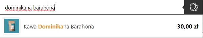
Ensure the presence of a search engine
A search engine makes it much easier to navigate through a user’s site. In many cases, its presence helps reduce the time it takes to find the right product. Its location is also important – ideally it should be placed at the top of the page, in the menu bar. It is also worth ensuring that the search engine has hints, thanks to which the user will immediately receive products matching the entered query.
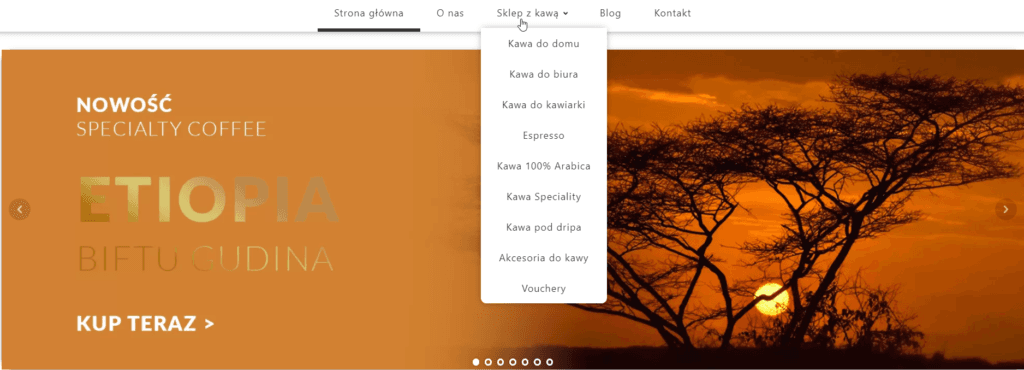
Bet on a clear menu
One of the most important elements of a UX-optimized online store is a clear menu, divided into categories and products. Recently, the mega menu, which is a large block containing all the most important categories, has become very popular. It allows you to place links and individual products, along with an image. It’s a good idea to set it up so that the menu bar is glued to the top of the screen and expands downward when hovered over, creating a clear structure.
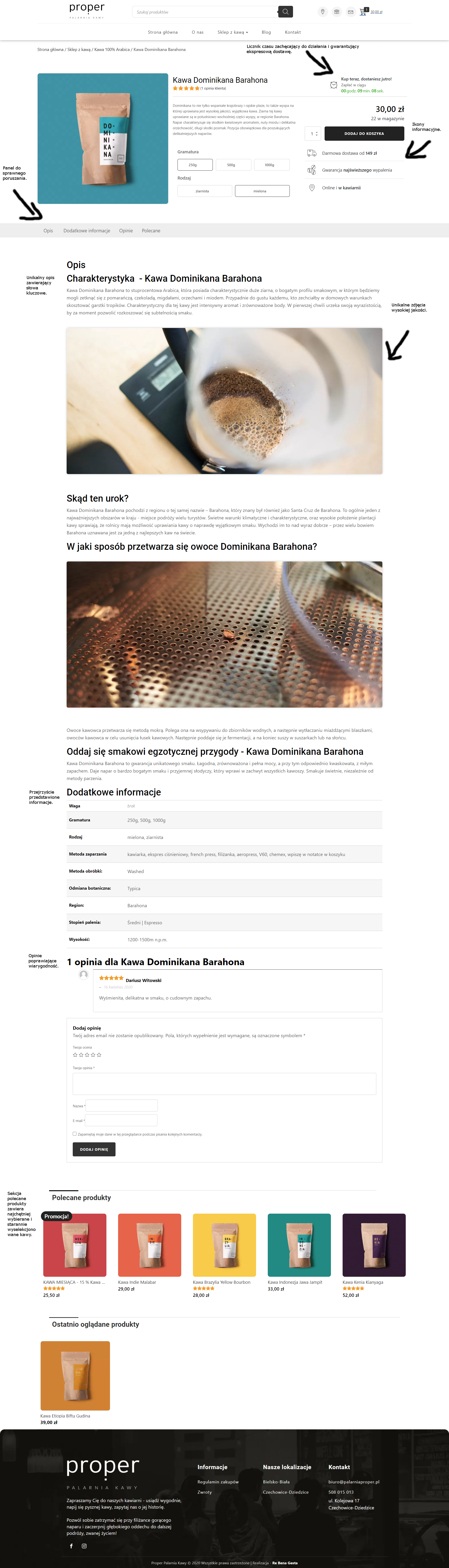
Optimizing the product sub-page for UX
One of the most essential elements of optimizing your store for UX is to make sure you design a clear product sub-page to encourage action.
Position CTA buttons strategically
Proper placement of CTA buttons is a very important part of an online store. When placed effectively, they allow the user to perform a specific action more easily. What should you keep in mind? First of all, make the message clear and easy to read, but not pushy, and make the button’s color scheme stand out from the page.
Use security and quality icons
On the Internet, most content is scanned by users, not read. It’s worth taking this into account and applying icons to inform the user that our store is trustworthy. This primarily involves elements such as:
- return guarantee
- free delivery after exceeding a certain order threshold (e.g. PLN 200)
- icons of available payments (Visa, Apple Pay, PayPal)
- companies with which the store cooperates
- user reviews
- contact icons (phone, email)
- chat icon
- clearly presented characteristics of the product
Choose high-quality photos
The use of high-quality photos directly affects conversions. If you choose poor quality images then you can be sure that some users will lose interest in the product, due to the fact that it will not be presented in the best way. It is worth considering presenting the images in a 360-degree rotation format, which some foreign stores already use. Every buyer pays attention to the possibility to see several photos, from different angles, with the possibility to enlarge them.
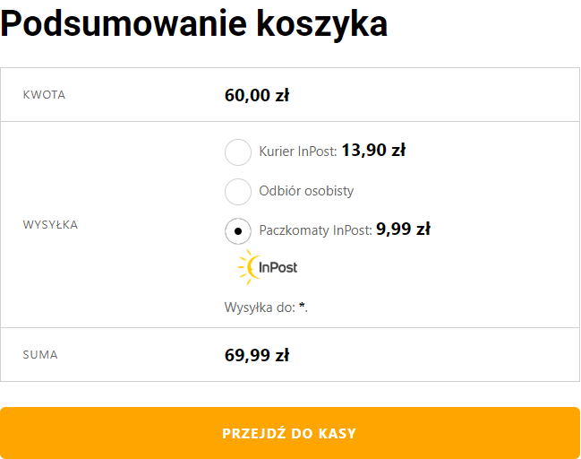
Outline the available payment and delivery methods
Users like to have a choice in how they pay for a product. In most cases, payment is made by bank transfer, but in the case of other possible forms or conditions, such as the need to pay in advance, it is useful to present them in advance.
Take care of the category view
The category subpage should be as clear as possible and oriented to highlight the products. The main point here is not to distract the user while browsing the products and avoid excess stimuli.
Add product filtering
The product filtering section is one of the best solutions you can provide to your users. The more products and categories we have in the store, the greater the importance of product filtering.
In conclusion… the devil is in the details.
A lot of factors influence the final sales result. It is worth keeping these in mind. It is very difficult to get above-average results right away – it requires, first of all, time, which must be spent on analytics and learning from the actions already taken.


