UX Contact Form: How to Design a Form That Increases the Number of Leads?


A contact form is often the shortest path from interest to a lead. At the same time, it can be the point where a website loses a user due to too many fields, unclear prompts, or poor performance on mobile devices.
UX for a contact form isn’t just about the appearance of the fields. It’s about deciding what information is truly necessary, in what order to collect it, and how to minimize friction when the user is close to making contact.
This topic ties into lead generation, because the number of leads depends not only on traffic but also on the quality of the final step on the page.
You can find more content like this on our blog.
Key Takeaways
A contact form’s UX should be simple, clear, and tailored to the value of the contact. The greater the friction, the higher the risk of form abandonment.
The most important elements are the number of fields, their order, labels, error messages, mobile UX, consent, and trust in the submit button.
A good form collects only as much data as is needed to start a conversation, not as much as the company would like to know right away.
Which fields are truly necessary?

In a lead form, it’s best to start with the bare minimum: first name, contact information, and a brief description of the user’s need. Additional fields make sense when they help qualify the inquiry more quickly, but each one increases the user’s effort.
What improves a form’s effectiveness?

- short and clear labels,
- clear error messages,
- clear information about what will happen after submission,
- mobile responsiveness,
- a clear CTA button,
- trust: privacy, response time, contact information.
How does a form contribute to conversion?
The form is one of the main places where conversions take place. If a campaign drives traffic but the form is clunky, the problem may seem like poor advertising, even though it’s actually a UX issue.
How do you test a form?
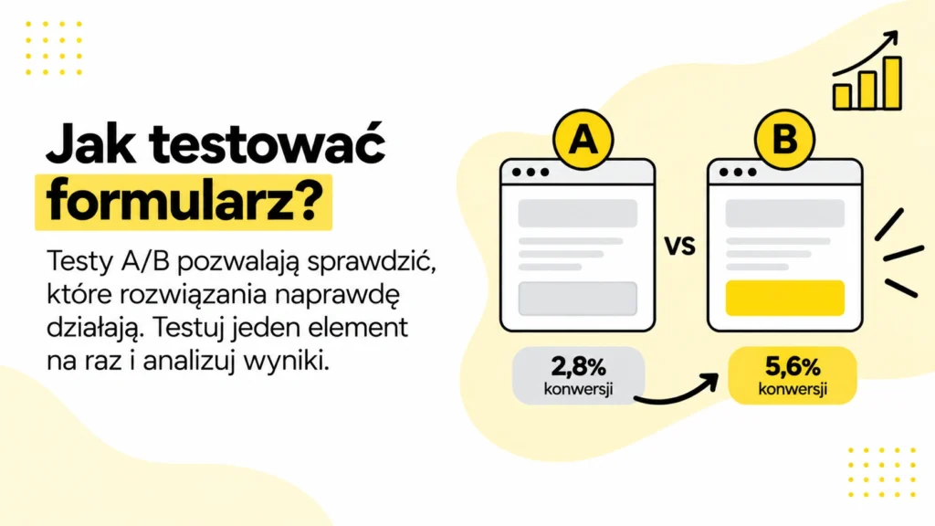
- Check how it works on a phone.
- Test the error messages.
- Measure the number of forms started and submitted.
- Compare the shorter and longer versions.
- Ensure events are tracked correctly in analytics.
Expert Insight

The best form is one that doesn’t immediately try to replace a sales conversation. Its purpose is to initiate contact. A form that’s too elaborate often feels like an interrogation, and the user isn’t at that level of trust yet.
How can you reduce friction in a form?

Friction occurs when a user has to do more than they consider necessary. This could be too many fields, unclear labels, a lack of information about response times, or a form that’s difficult to use on a phone.
- Remove fields that aren’t necessary for the initial contact,
- use clear labels,
- highlight errors next to the corresponding fields,
- include information on when the company will respond,
- test the form on mobile devices,
- ensure fast loading times and no page jumps.
How can you balance the number of leads with quality?
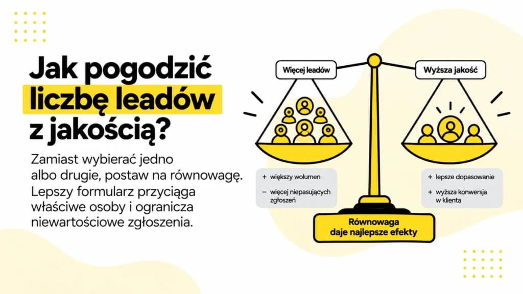
The shortest form may increase the number of submissions, but it can sometimes lower their quality. In B2B services, it’s best to collect the minimum information needed to evaluate an inquiry, but not require everything before the first conversation.
In practice, it’s worth combining this analysis with data from tools, user behavior, and real business goals. Only then does the topic become more than just a definition—it becomes a decision-making tool.
Example of Application in a Real-World Project
Let’s imagine a situation where users reach the bottom of a page but abandon the form or submit low-quality inquiries. At first glance, this might seem like a single technical or editorial issue, but in practice, it usually involves several layers simultaneously: content, structure, data, UX, and business objectives. That’s precisely why a contact form’s UX shouldn’t be analyzed in isolation from the entire page.
The best approach begins with a diagnosis. Before creating a list of tasks, you need to determine what is actually hindering the result: a lack of content, an unclear structure, poor measurement, incorrect implementation, or a mismatch with the user’s intent. Only then can you decide which actions have the highest priority and how to measure their impact.
In practice, the process involves simplifying fields, improving labels, microcopy, error messages, and the mobile experience. This approach prevents a chaotic scramble to fix everything at once. Instead, it allows you to select the elements that have the greatest impact on visibility, traffic quality, conversion, or the user’s decision.
How can you deepen your analysis before implementation?

Before implementation, it’s worth asking a few key questions. Thanks to them, the “UX contact form” stops being just a buzzword and becomes a concrete decision-making process. The answers to these questions should be based on data, sources, user behavior, and an analysis of the current website structure.
- What user problem is this change intended to solve?
- Does the current website already partially address this intent, or is new content or a redesign needed?
- What data confirms that the problem actually exists?
- Which subpages, forms, campaigns, or content will be affected by the change?
- How will the impact be measured after implementation?
- Will the change cause new cannibalization, duplication, or a deterioration in UX?
What should the reader understand after reading this?
After reading a well-written article, the user should understand not only the definition but also the implications. They should know when UX in a contact form matters, when it’s a secondary issue, how to identify the problem, and what mistakes to avoid. This is especially important in expert content, because readers are often not looking for trivia but for a practical answer to the question of what to do next.
It’s also worth outlining the scope of the topic. Not every action carries the same priority for every company. For a small service-oriented website, a clear offer and a contact form may be more important, while for a large website, technical indexing checks may take precedence. For a campaign with a small budget, the quality of search queries may be key, while for large-scale campaigns, path analysis and attribution may be crucial. Premium content should help distinguish between these situations.
Mini-checklist for quality before publication or implementation
- the content addresses the main intent, rather than merely defining a concept,
- Headings guide the user from the problem to the solution,
- examples illustrate real-life situations, not abstract ones,
- Practical sections explain what to do and why,
- The FAQ section answers the reader’s questions, not the needs of the author,
- sources support specific parts of the content rather than being a random bibliography.
If the text meets these conditions, the UX contact form is explained not only correctly but also usefully. This is what distinguishes an expert article from a basic SEO post: the user doesn’t finish reading with just a definition, but with a real understanding of the problem and possible actions.
How can you evaluate the form before implementation?
It’s a good idea to test the UX contact form before the page goes live. The simplest test involves walking through the entire process on a phone: from clicking the CTA, to entering the information, all the way to the confirmation message after submission. If the user has to wonder which fields are required, what to enter, or whether the form worked, it means the design needs refinement.
- Is the form visible at a logical point on the page?
- Does each field serve a clear purpose?
- Are the error messages specific?
- Does the user know when they’ll receive a response,
- and whether the form works well on a mobile device.
FAQ
How many fields should a contact form have?
As many as are needed to meaningfully start a conversation. For simple inquiries, fewer fields usually mean less friction. For complex services, some additional questions may be justified.
Is a multi-step form better?
It can be better if it collects more data and breaks down the user’s effort into smaller steps. However, it isn’t automatically more effective than a simple form.
Is it worth specifying a response time?
Yes. A message like “we’ll respond within 24 hours” reduces uncertainty and helps the user understand what will happen after submitting the form.
Summary
A UX contact form has a huge impact on the number of inquiries. Even a good traffic strategy can lose its potential if the final step is inconvenient.
The best form is short, clear, fast, and transparent with the user. It collects the data needed to get in touch, not every piece of information possible.


